Optimizing the UX for Oil & Gas IT Transformation
World's largest Oil field services company has taken an organization-wide transformation initiative. As part of the IT Transformation, designing for the user experience was a key initiative of this project. This team along with enhancing their processes, they also built an application which helps users reduce their task load and improve their work performance. In this large project, I was part of the UX team, collaborating with all levels of stakeholders both internal and external. In this role, I was mostly involved in brainstorming and gathering the requirements, and transforming them into usable interfaces.
My Role
Lead UX Designer
My Deliverables
Wireframes
Screenflows
Visual Designs
Styleguide
UX Review
Interview Stakeholders
Brainstorm-Product Owners & Business Analyst
Update for UX - Kanban Board
Our Team
Lead UX Designer (me)
UX Designer
Visual Designer
UX Strategist
Product Owners
User Researchers
Development Team
Testing Team
Business Analysts
Best Practices
Scrum of Scrum
Agile UX - KANBAN Board
Focus Group - Persona - Journey Maps
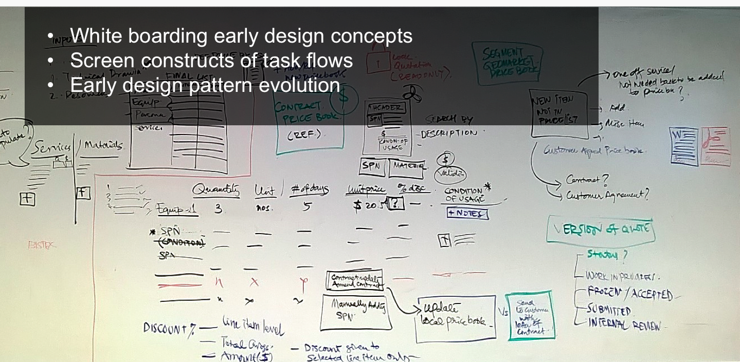
Paper sketches - Whiteboarding - Wireframes
Visual Design - StyleGuide
UX Review
Overall Process
The world’s leading provider of technology for reservoir characterization, drilling, production, and processing to the oil and gas industry, has taken an organization-wide transformation initiative. This IT transformation project is for the Product & Service Delivery (P&SD) Department to redesign their Field Delivery Platform(FDP). I was part of the User Experience (UX) team, which is the key initiative of this project and is a separate track along with SAP blueprinting tracks. My team as UX consulting defined the UX goals and served as a main target for the IT transformation.
When I joined this project, I didn't have much exposure to Oil & gas, and the project was in a discovery & research phase, which led me to learn along with the team. Starting from focus groups to understand the users, and the domain, it was quite an experience in a fast-paced environment. We successfully designed and delivered and tested the prototypes with the stakeholders who are also the users of the application.
The project went through a lot of changes during the time I worked, from having an early concept to having a structured design process, and an agile-based design process having KANBAN boards for user stories. Also collaborating with the UX Center of excellence team of User Researchers and external UX designers.
Challenges
The major challenge of this project was designing for one experience which would fit for various segments such as Wireline, Well services, etc, along with the evolving business processes. As some of the segments used many internal applications, some of them used phone calls and emails to get their job done. To bring a UI to these functions required to understand the business, system, and importantly the people who use the application.
Provide a single platform to support end to end job lifecycle for various segments, sub-segments, Geo markets having a common user experience
Manual entry, Email, SAP data entry to be brought into the new system
Scalable UI to meet future demands, managing segment variation
Address user pain points on Data capture, Resource visibility for Order management, Project, resource management
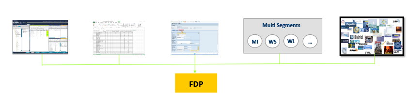
Various systems and Processes provides input on the FDP
Evolving business process, mergers and applications from various platforms.
Understanding the People in the System
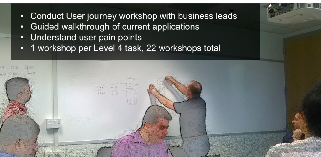
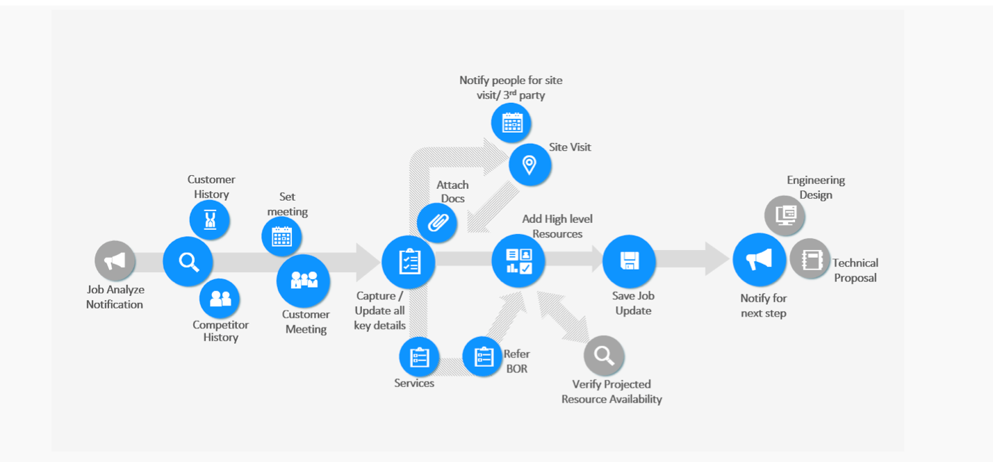
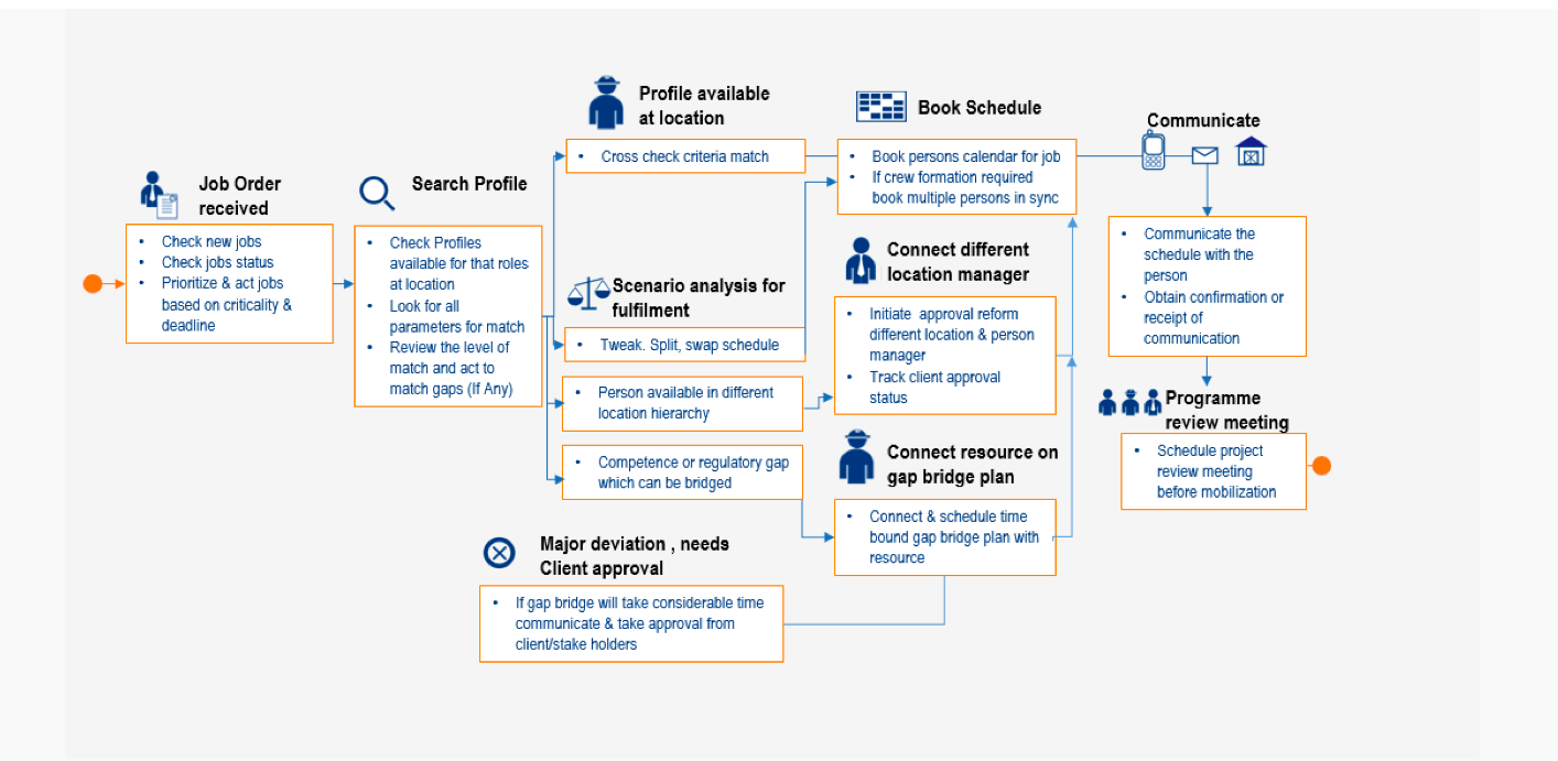
So how did we overcome these challenges? Along with the below UX best practices and as part of the focus groups, I understood the process, broke them into various steps by task analysis, understood the requirements of the users. I spoke to the product owners where they would come with their requirements.


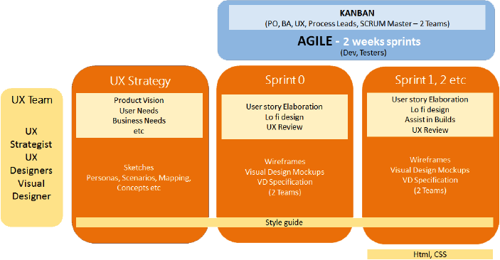
Agile UX/ Kanban
Our team, consisting of Subject matter experts, Process leads, Product Owners built a shared understanding of the system. Created user journey maps, tasks analysis, Information architecture, serving as a foundation for future design & development decisions. Taking the knowledge & understanding from the research activities and elaboration during sprints, various sprint cycles were achieved. This also provided an opportunity to educate the team members about User experience design & process.
Understanding the System


Design Solutions
Design for seamless user experience both in visual design and interaction across segments and devices
Create a single platform to perform tasks which is currently being done through various applications
Consistency and quality throughout the application behavior and interaction pattern
Make a concerned effort to reduce looking for information outside the system.
Set standards through design style guide & specifications for unique screens designed
Prototype Demo
Key screens & Interactions I owned
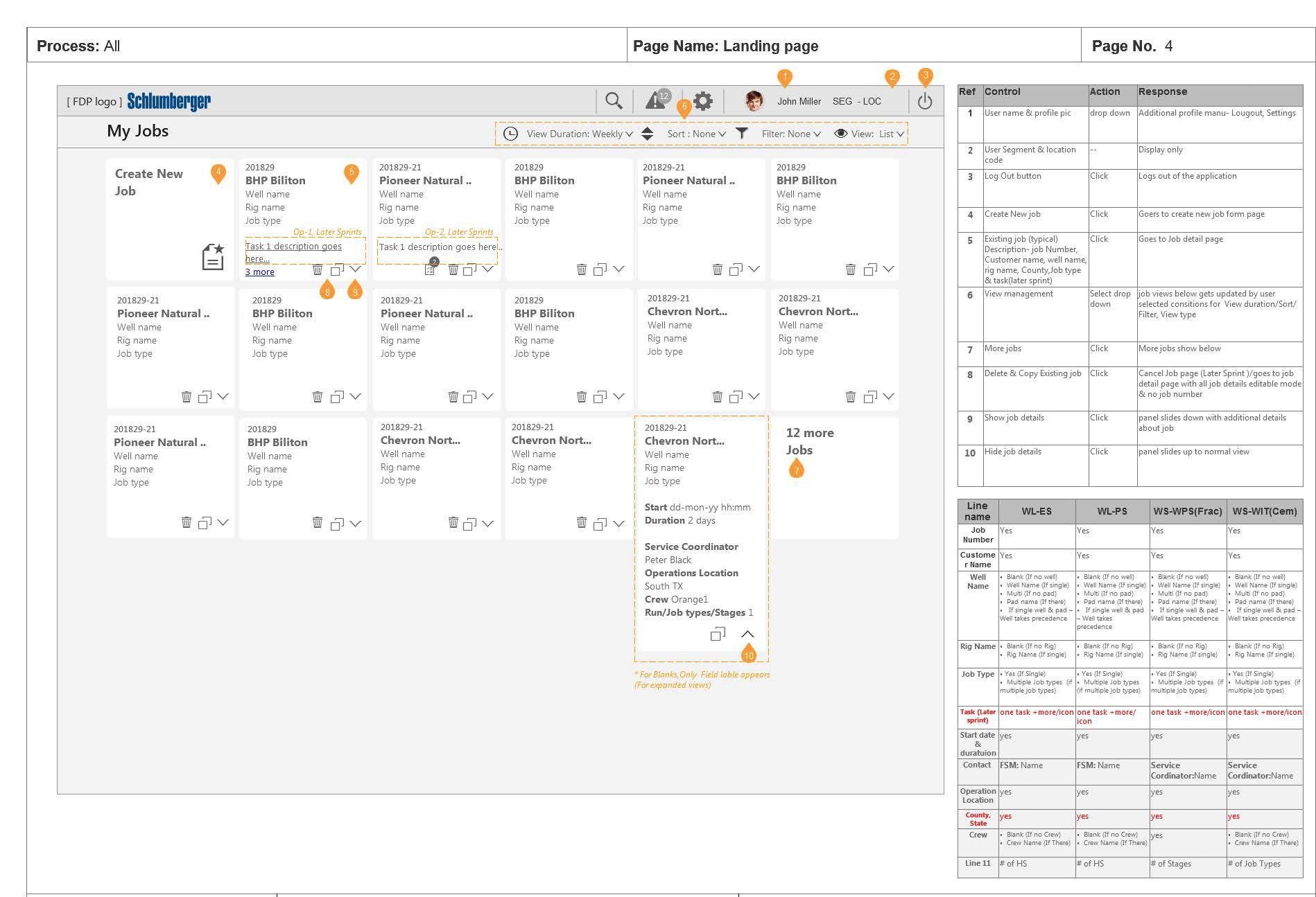
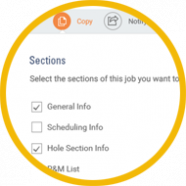
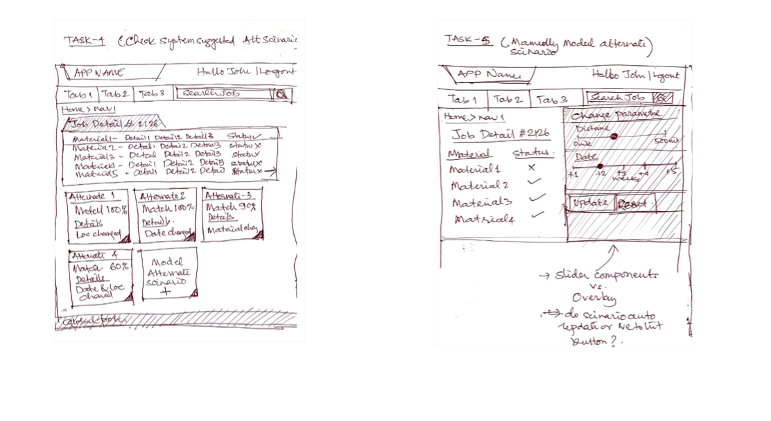
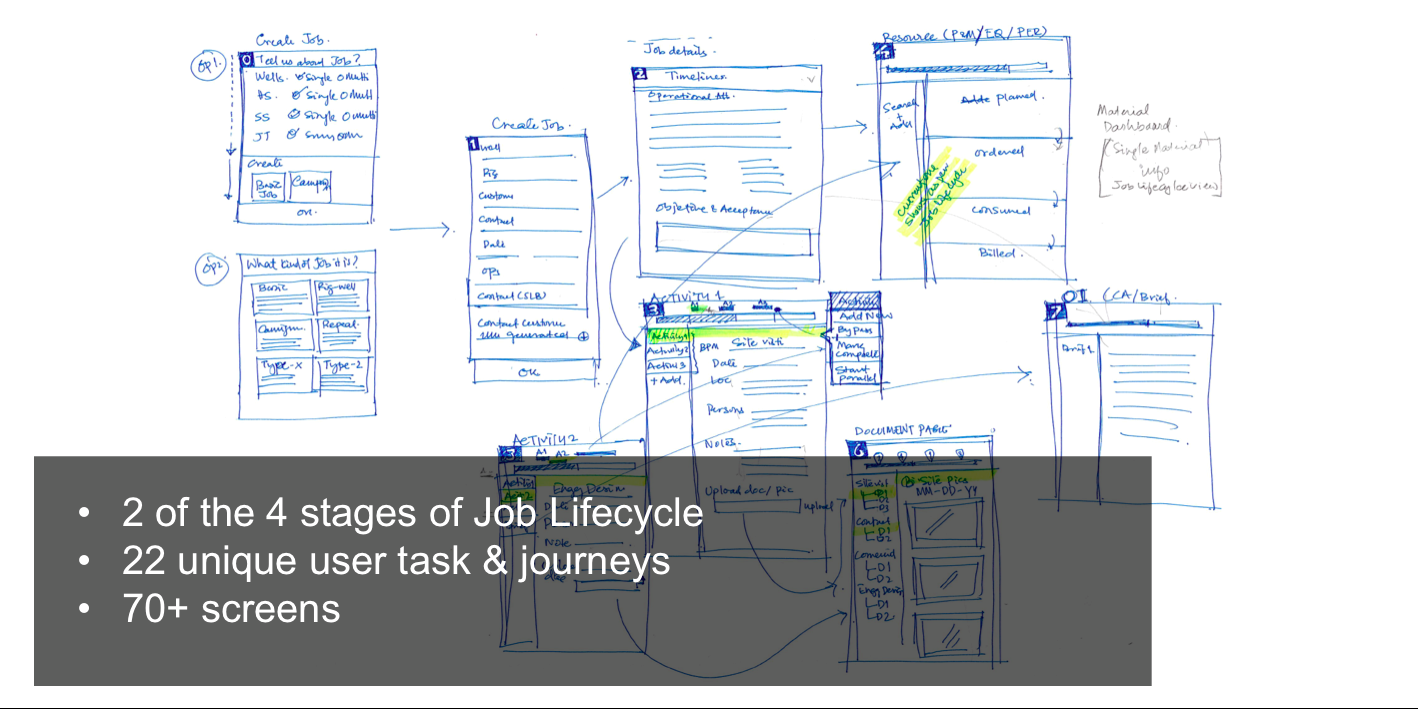
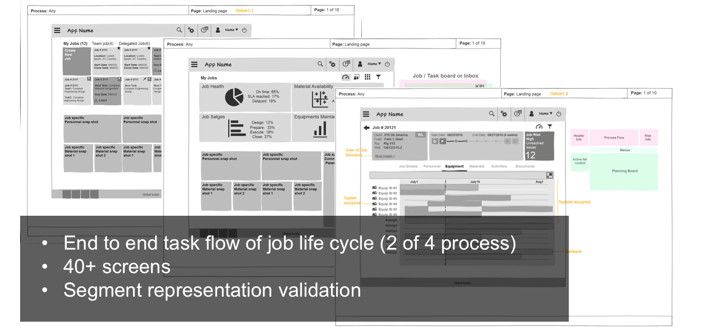
During Sprint 0, I joined this project and there were many different early concepts were available. I brought in the information architecture to optimize the Navigation and Page types. The early concepts from the previous designers became a starting point in the below key screens and major of its interaction features, which I owned. After a few weeks of my time in the project this became an agile-based design project, the design decisions were mainly based on best practices and user requirements. However, as a larger team, collective feedback was encouraged for providing the design to the development team. Some of them were inputs and decisions based on collective feedback from the team.
The Interfaces evolved over various whiteboarding sessions, paper prototypes, wireframes. Once I had the wireframes out to share with the team, with the help of the visual designer, the wireframes were converted to visual designs, which I made sure it sticks to the standards of the UX CoE & our product style guide. Since this is an Agile-based design, I continued working on the Visual design for the addition of small features.
Forms Pages
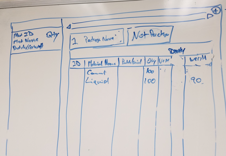
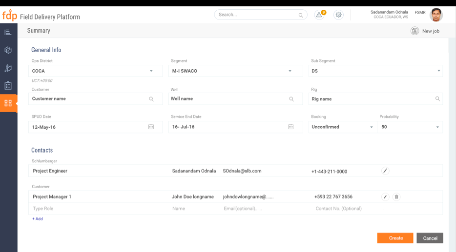
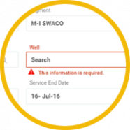
While we have to consider the various backends connected to the form, having the user in mind, we were able to provide simple forms out of complex backend. One main thing I worked on is to simplify the existing forms from the SAP application, to have a minimum number of fields, and for easy input.
Landing Page - Concept to Creation
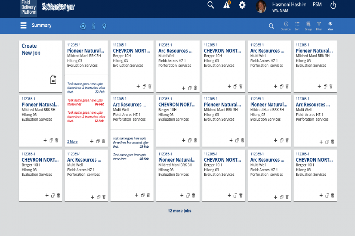
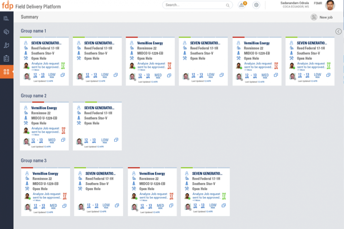
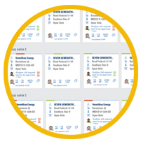
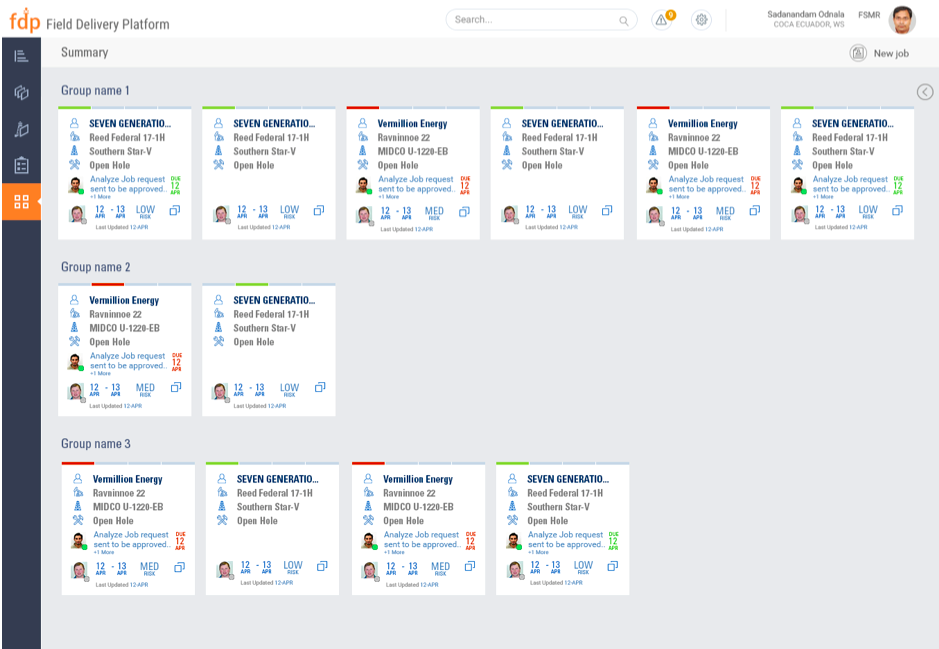
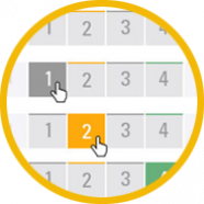
All we wanted to provide the user is a list of jobs, prioritized based on the job status, we tried various options of showing the jobs as cards, list, Gantt charts. Also based on the user role, the jobs would appear for the user. The challenge here in designing the cards based layout was that When users are looking for one specific piece of information, scanning through cards were annoying. I worked with various segment product owners to understand what would they like to see on their landing page, card (a job). Then identified the customer name & the job number is a common thing all segments mostly refer to, so I proceeded to show the job number as the first item for the user to recognize. Also, the visual designer added to its importance.
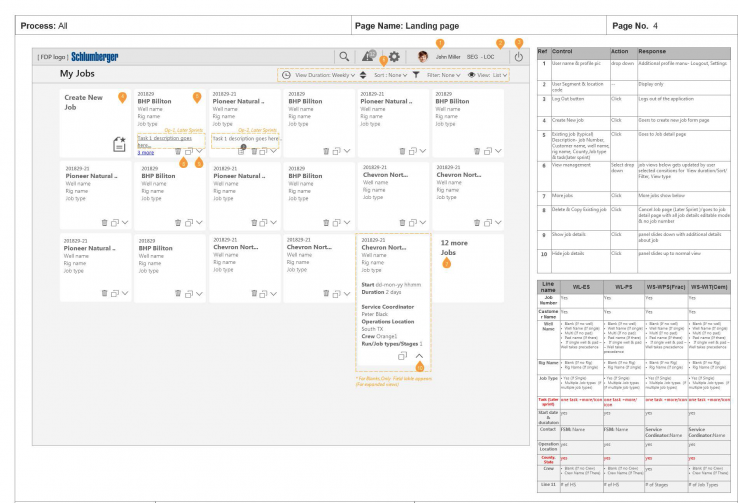
Cards based layout design
A large amount of information of a job, when many jobs exist, they are chunked with very important information, on a card-based layout
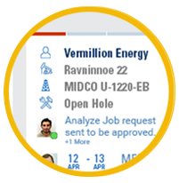
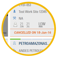
Visual indication of statuses
Status of a job such as design, prepare, execute, close are given visual indication in a card. Tasks status, Personnel, dates are also highlighted
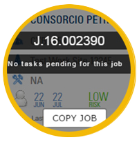
Call to action
Various action taken on a card is clearly indicated with “call to action” along with the standard interaction of a card.
Roles based view
The UI changes based on the roles logged in, read-only view, section hidden only for selected roles.
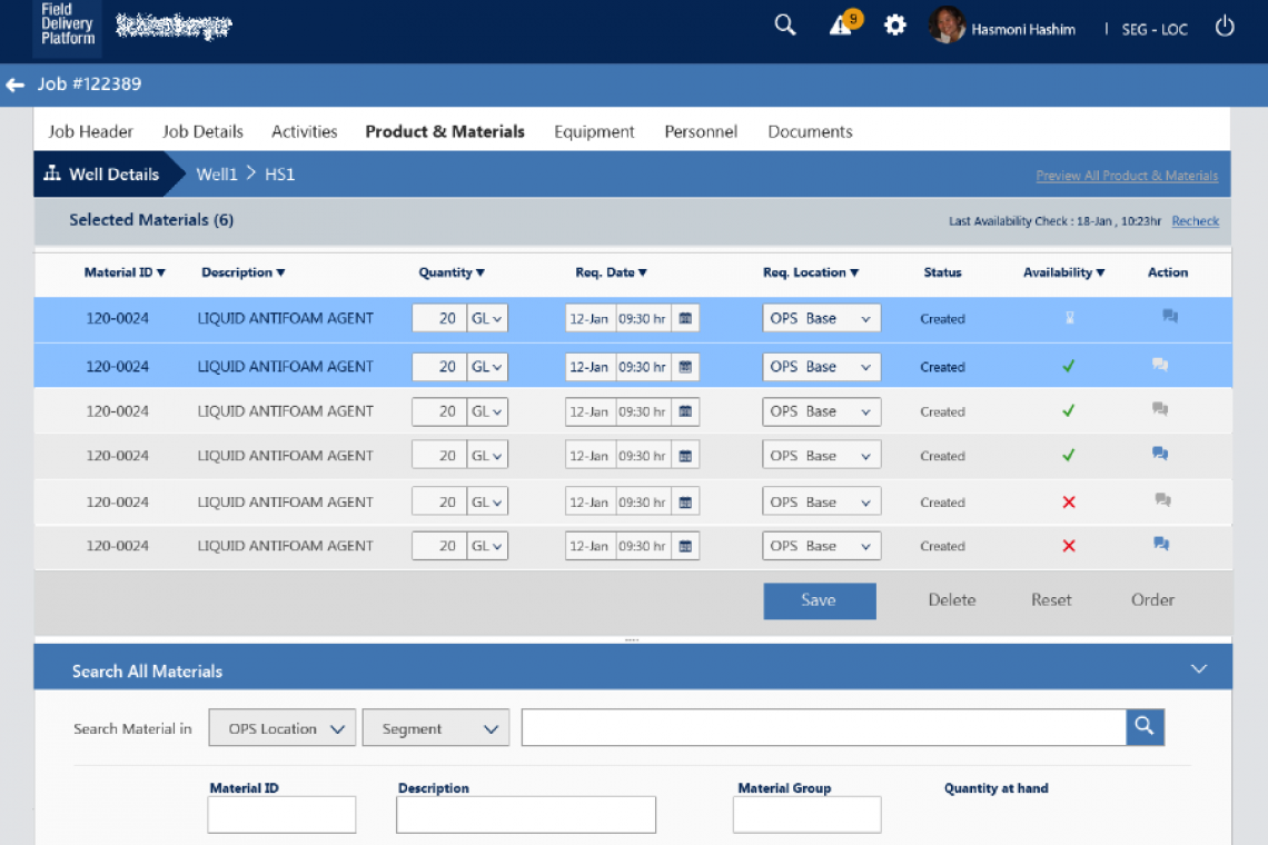
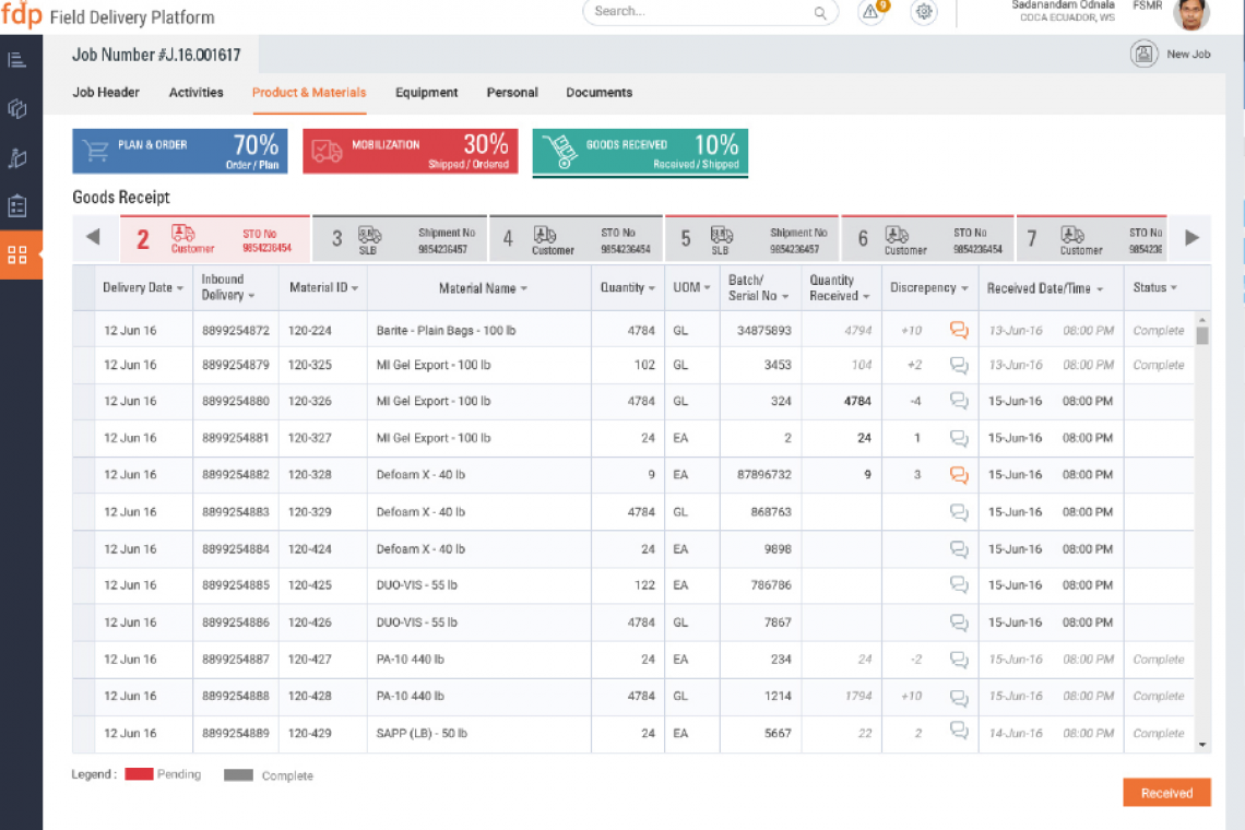
Products Page - Problem & Solution
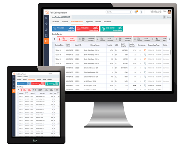
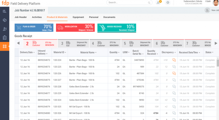
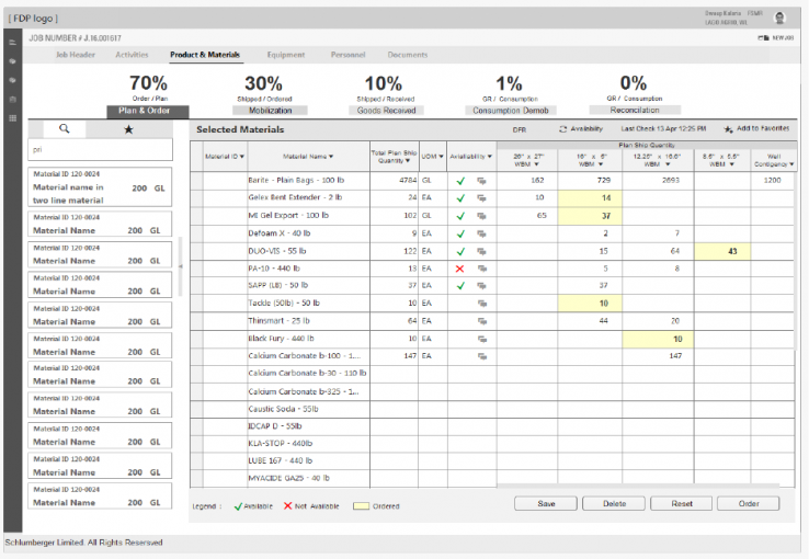
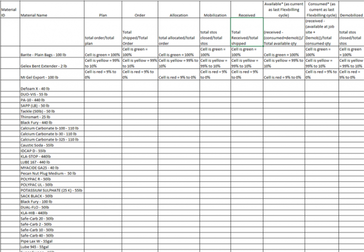
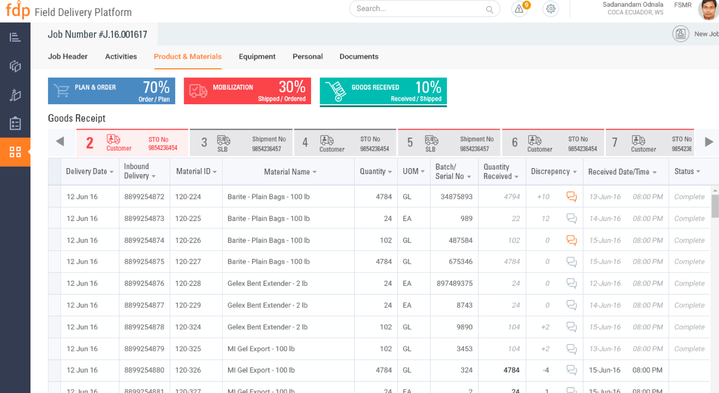
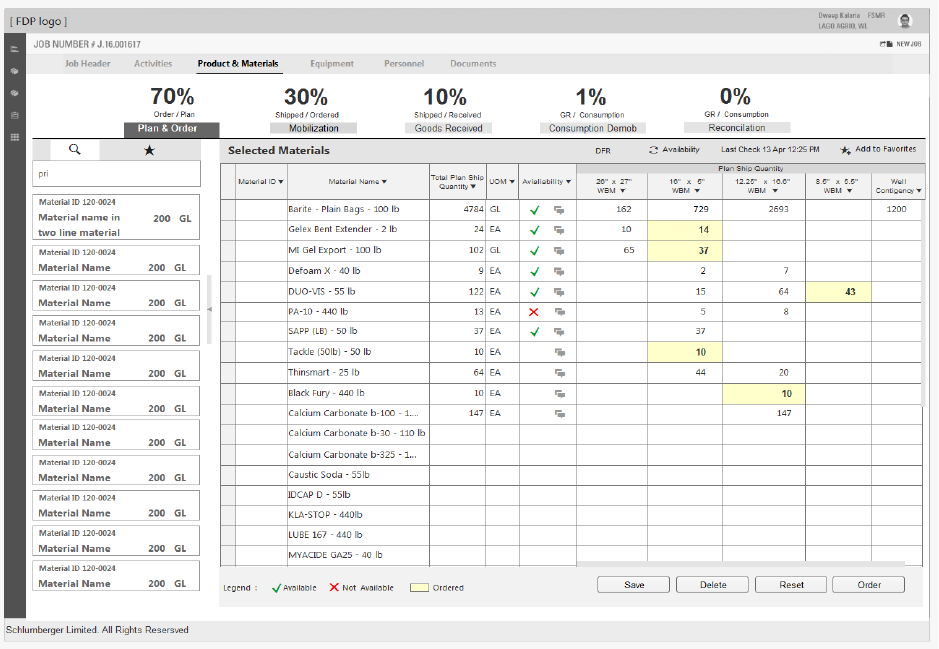
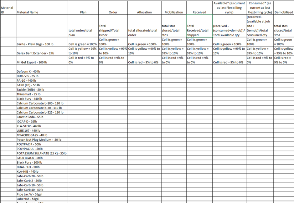
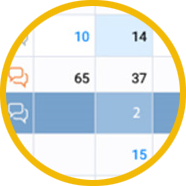
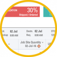
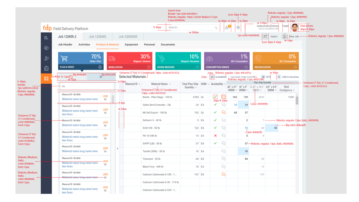
There were different stages in a product lifecycle from plan & ordering to mobilizing the products to a particular location and demobilizing them back to the warehouse. The challenge here is the users didn't have a single place where they can track one single product till the end of its lifecycle. They used various methods to keep track of a product. We understood this by having many discussions with various stakeholders involved in the product lifecycle. In this product lifecycle, we received one single excel with product name, which had many statues of its own. I am happy and proud to have given a very good solution of showing the percentage of the overall product statuses along with the individual status of the product list. I worked with the product owner and a business analyst to come up with this design, which we also discussed with the development team for their feasibility. This design was welcomed by many stakeholders and developers who understood the user needs.
Data Entry – Excel based
Most users are accustomed to excel, to provide the same behavior along with a consistent layout, the data entry is excel based on ease of use.
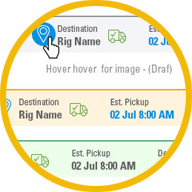
Product Lifecycle Status
The P & M planning & its statuses are given upfront for the user to be aware of the planning & ordering of the materials. Currently, this is done manually by emails & phone calls or through sap data entry.
Content Organization
Visually organized content based on every action performed on the P & M. Made flexible to match the process of creating a draft, in progress, completed batches.
Consistent Look & Feel
Throughout the Product lifecycle, a consistent look and feel is provided to enable the user for recognition & recall.
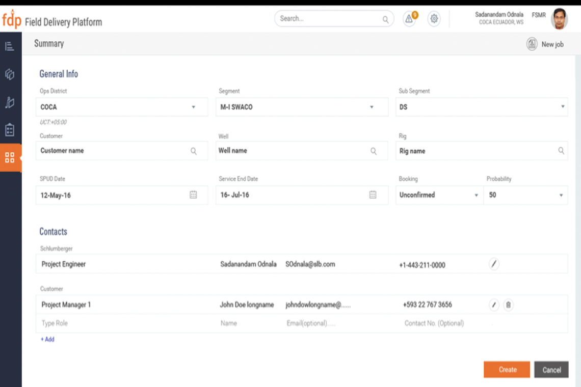
Form - Create New Job
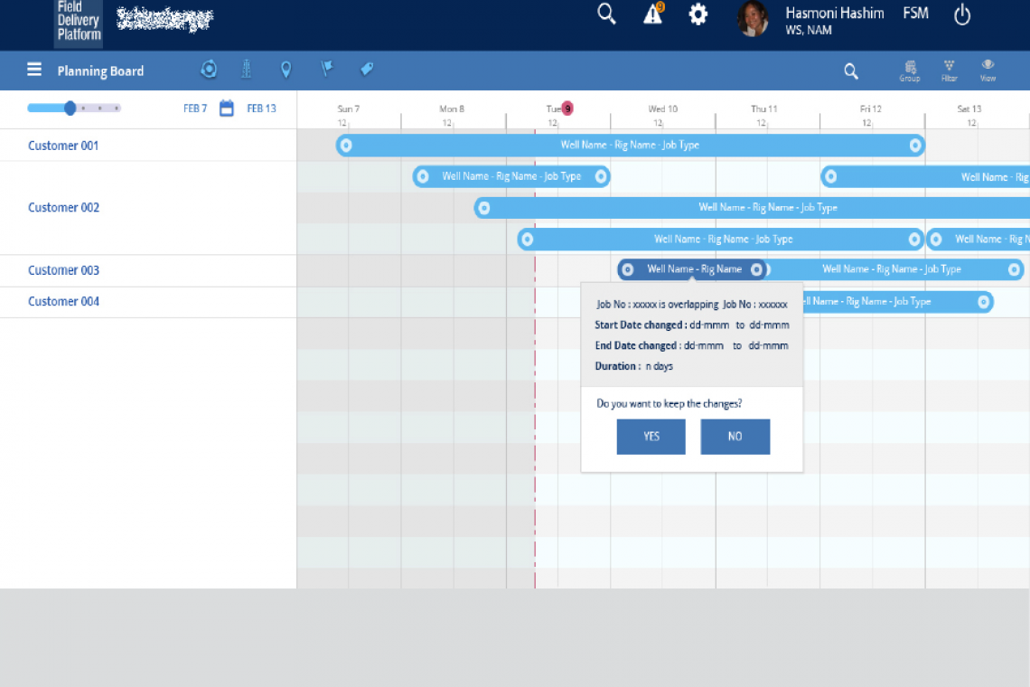
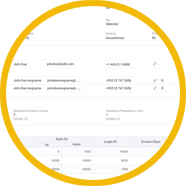
I worked on form pages varying from a single form page with fields, tabs, accordions, etc. to table-based form and Gantt chart based input. This project had forms in the form of a table to input values in excel based form page. The development team used Kendo UI, which I studied to understand the limitations of the excel-based input form. Also, there were inputs on Gantt charts to update the job information. While working with another designer on the same form design, we made sure we have the same form fields and styles for uniformity.
I wonder why we didn't have a design system in place, while we were updating our product style guide and also referring to the client's branding style guide. As this project was at the stage when they are having a new UI, they were still discovering how the big picture of the design process would work.
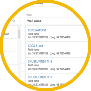
Data Capture – Simple & Quick
Auto suggestion based keyword search & entry of data is quick for data input
Standardized error & messages
Errors, warning messages, confirmation messages based on the UI level, SAP backend are standardized for the user to take action.
Optimized usage of space
Vertical space is utilized only for relevant data shown on the capture of the data, such as expand & collapse of the section captured.
Compatible for Devices
Responsive form fields for IPad and desktop was designed.
UX Process I was part of
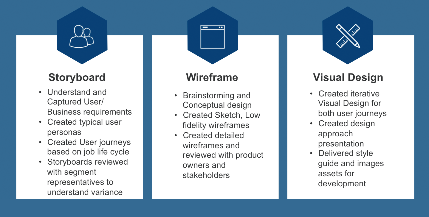
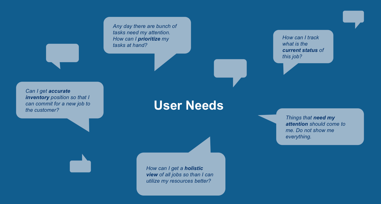
User Needs
Process Workshops
Task Analysis
User Journey
Early Conceptualization
Paper Prototypes
Information Architecture & Screen Flow
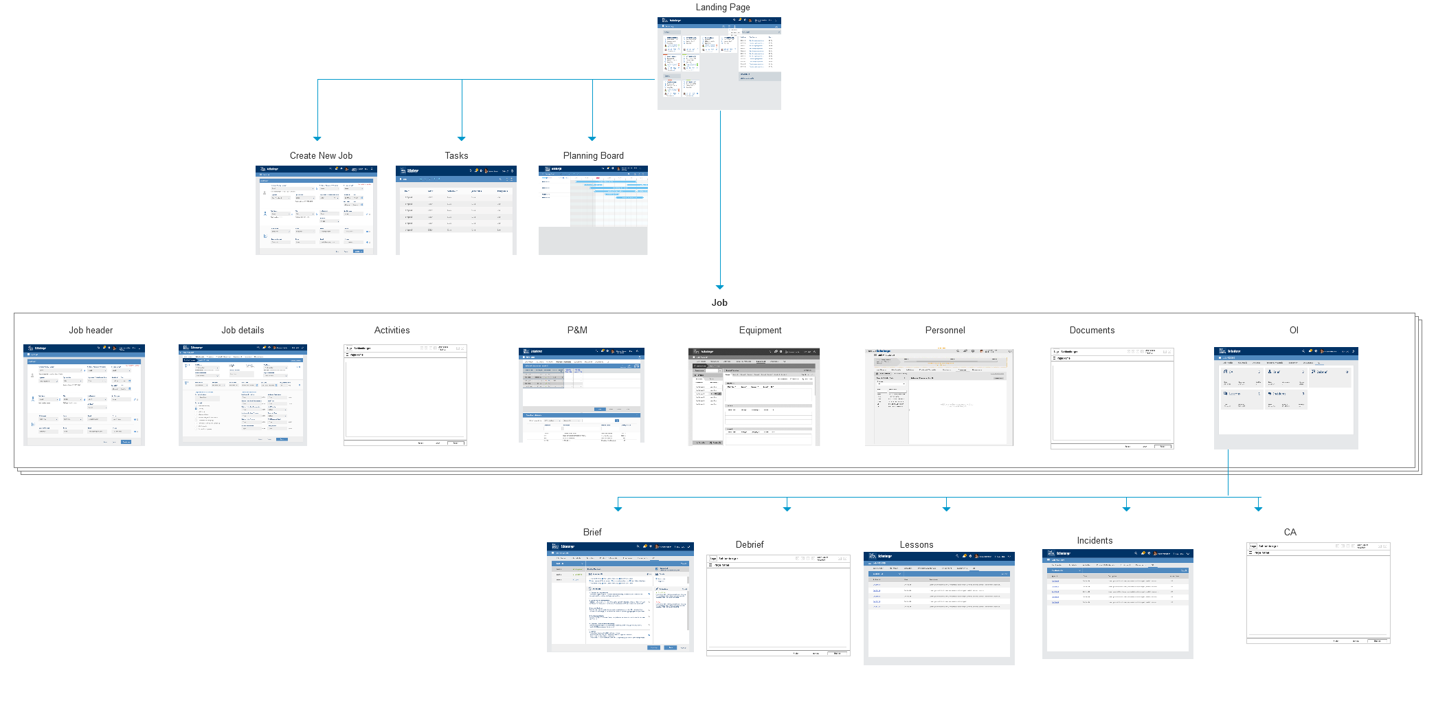
Screenflows
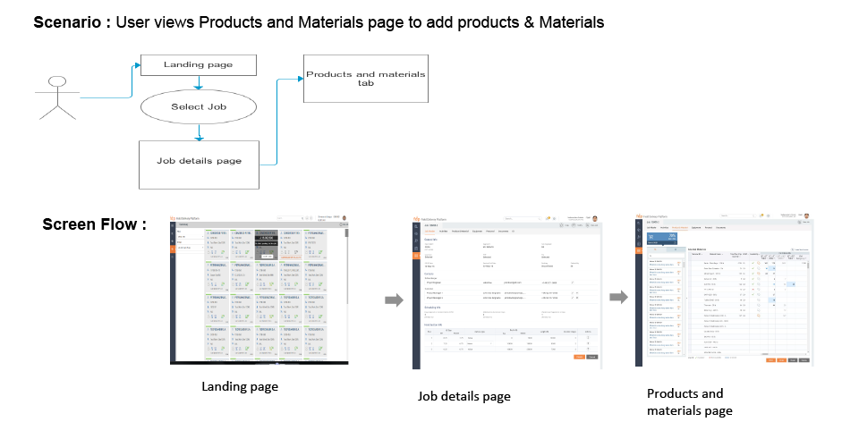
I created various User scenarios and its corresponding screen flows as a document to analyze the flow of the interfaces and optimized the number of screens. This task helped in having a consistent and uniform interaction across segments for any particular task. I was part of MI DS, WL, WS segments interface designs, for this activity.
Lo-fidelity Wireframes
Production Artifacts
Specifications
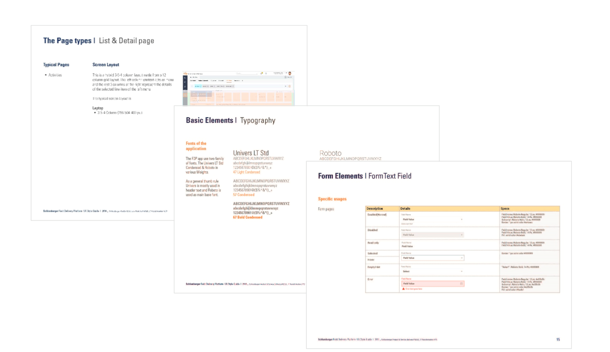
Styleguide
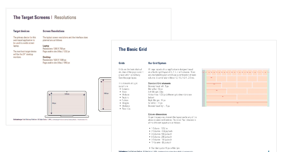
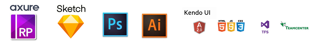
Tools
Some of the tools I used in this project
Conclusion
This project is important to me because I was introduced to the Oil & gas domain, which had an evolving business process. I am happy to be part of the IT transformation which led to simplifying many users life in getting their job done easily and effectively. I gained a lot of experience in showcasing my ideas, and proud of giving good design solutions.