Mobile First Responsive Design System Redesign
About 15 + Mobile friendly responsive websites fit well on small screens, without overflowing, however endless pinching and scrolling were required. This Pharma company's B2C drug websites have a very good user base and web traffic. To make it easier for the patients/ doctors/ nurses or anyone who uses the websites, we took an initiative to make the websites for Mobile-First Design. The first step was to redesign the existing Design System.
My Role
UX Designer - Remote
AEM Author
My Deliverables
Heuristics Analysis
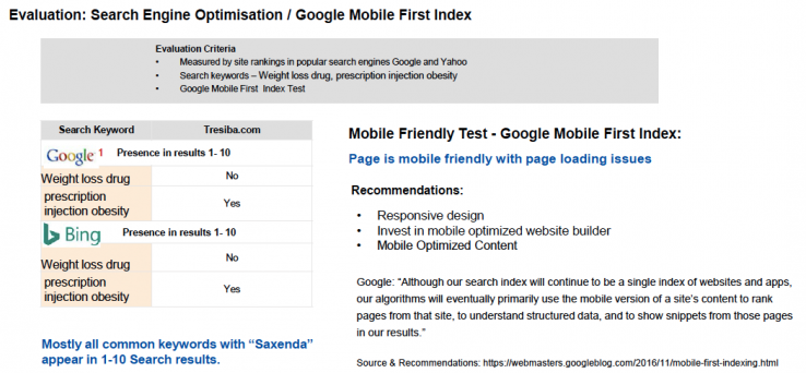
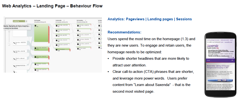
Web Anlaytics
Wireframes
Atomic Design System
StyleGuide
Our Team
Delivery Manager
Development Team
Best Practices
Mobile First UX Review - Heuristics
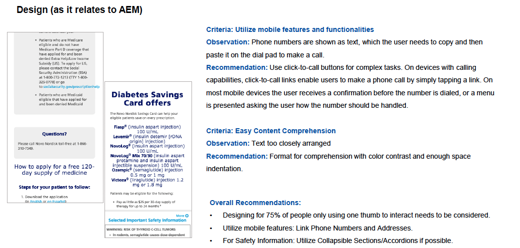
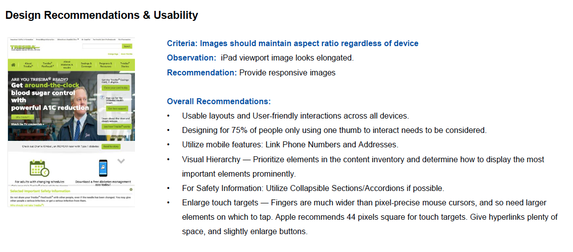
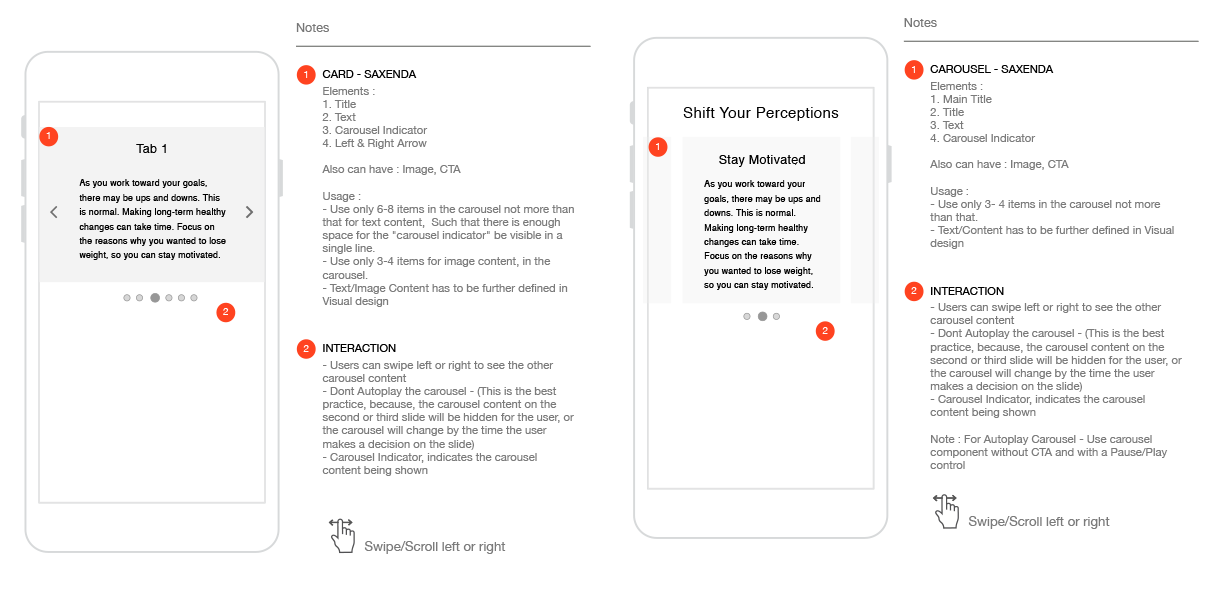
Design System Redesign - Components
Mobile First Design
Overall Process
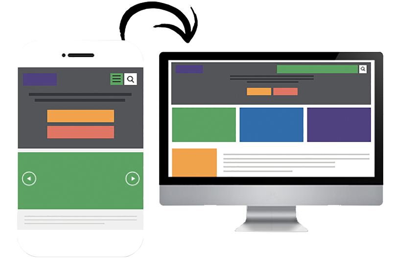
This Pharma company has individual websites for prescription drugs, each responsive website has its own brand and style, however, the overall layout of the websites dont have extensive variation. They are authored as Adobe Experience Manager, and they follow a design system created using Bootstrap. All the websites are mobile-friendly and responsive and not designed for Mobile First. They had a strong user base both new and experienced users and very good web traffic. Their web analytics report had evidence of more traffic from mobile devices.
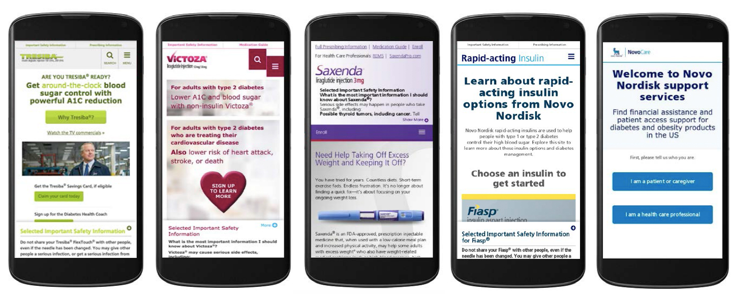
When I joined this project, the client was sure they wanted their websites usable on mobile devices. They also reported that their website was mobile-friendly. So I introduced the Mobile-First User Experience Design explaining through the User-Centered Design Process and its benefits. To start with Expert reviews of the websites were done. I reviewed the 5 websites specifically for Mobile. Then design for responsive mobile websites simultaneously redesigning their existing design systems.
Design Process
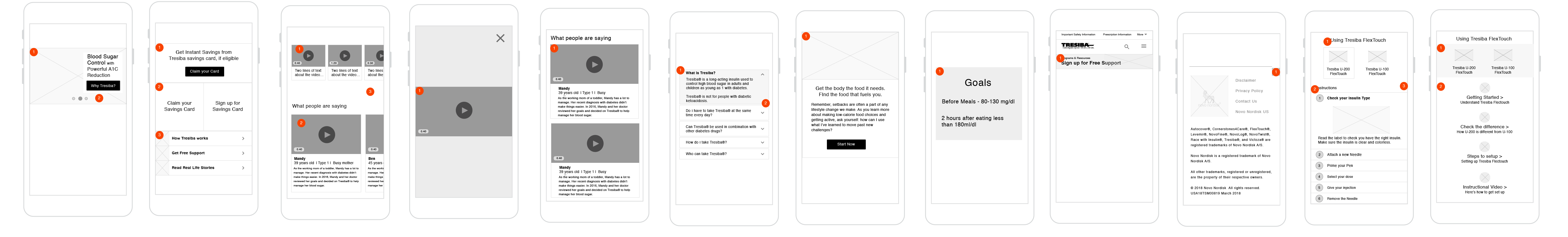
About 15 + drug websites , needed to be redesigned for Mobile First. So we picked up the common layouts of the overall websites, from which we identified 5 common website layouts to redesign.
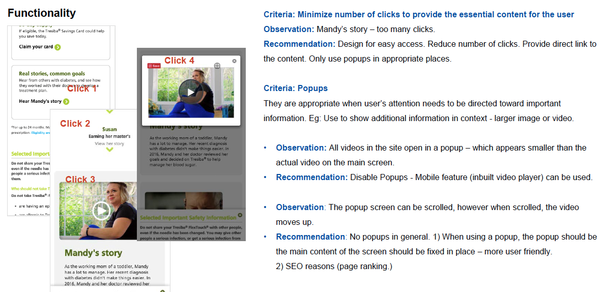
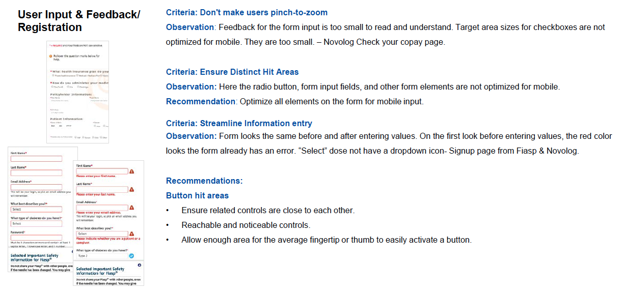
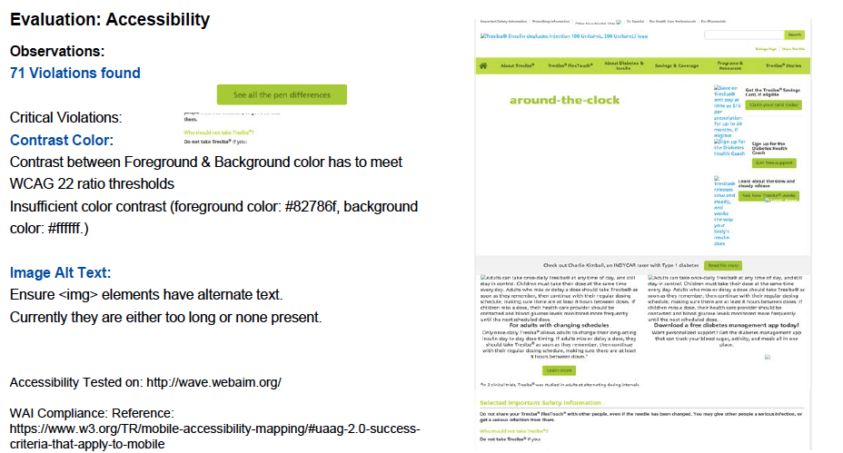
Mobile First UX Review
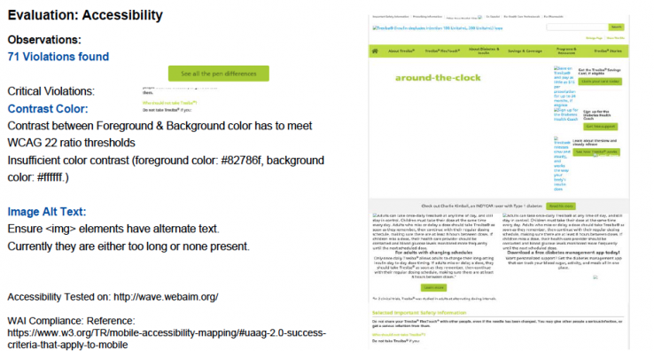
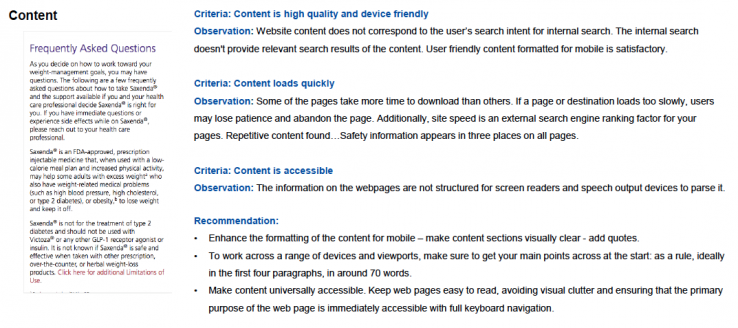
A heuristic evaluation checklist developed specifically for assessing the usability of mobile Interfaces was used for the UX Expert Review. This checklist is a combination of standard software heuristic checklists from leading authorities in the field and adapted them for evaluating touchscreen devices.
Mobile First Design
Visitors to the website will not initially distinguish between a responsive, adaptive, or mobile-first website. What’s important for visitors is the ability to quickly and easily find the information they need—and perform the actions they’ve set out to do. In fact, I like to think we adopt a consumer-first strategy while designing websites.
Mobile First UX Review
A heuristic evaluation checklist developed specifically for assessing the usability of mobile Interfaces was used for the UX Expert Review. This checklist is a combination of standard software heuristic checklists from leading authorities in the field and adapted them for evaluating touchscreen devices. Reference: Heuristic Evaluation for Mobile Interfaces
Review for Mobile Design - Landing Page, Navigation, Information Design


“Adding Value to our Team
“Kirubha did an excellent job providing a detailed analysis that we will use to help inform working in AEM to create a Mobile-First Website. The analysis was extremely insightful and useful.”
NNI Client
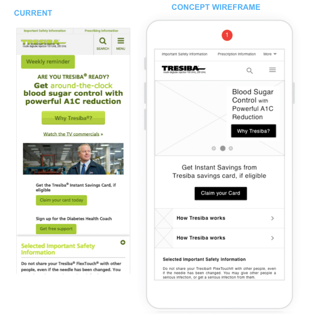
Design System Redesign
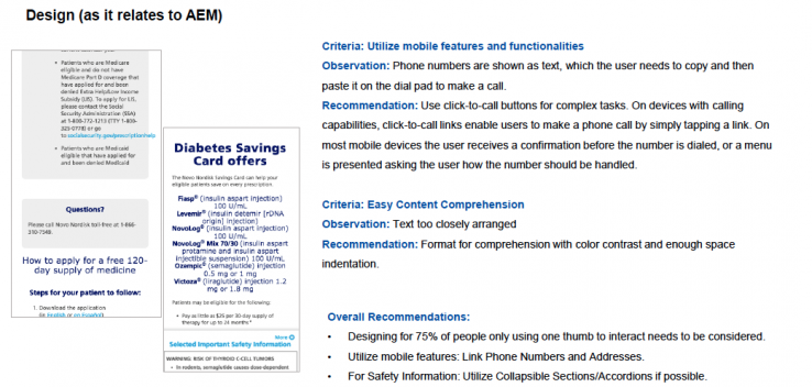
The client's existing Design system was developed in Bootstrap. To keep up with the Mobile-First Design and branding & Style, this design system has to be redesigned, It's an on going project, and right now the wireframes are being taken to the next level. Reference: Existing Design System. I also spent time on understanding the authoring tool - Adobe Experience Manger for the components structure while authoring.
CTA Component Redesign
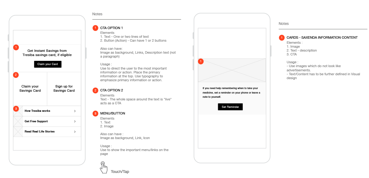
Cards & Carousel Component Redesign
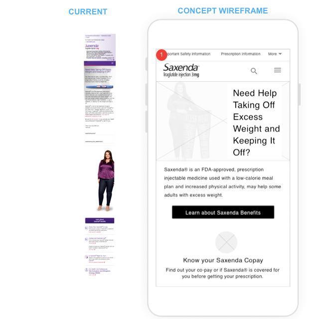
Mobile First Design
Visitors to the website will not initially distinguish between a responsive, adaptive, or mobile-first website. What’s important for visitors is the ability to quickly and easily find the information they need—and perform the actions they’ve set out to do. In fact, I like to think we adopt a consumer-first strategy while designing websites. I designed the key concept pages with the identified Mobile-first components.
Homepage Wireframe
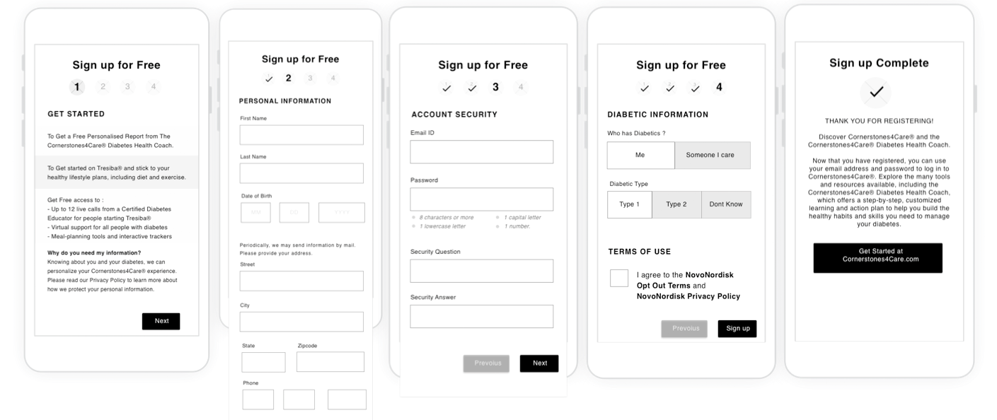
Form Page
Tools
Some of the tools I used in this project

Conclusion
This Design System had Style Guide, Pattern Library, Components Library already available. For Redesigning this Design System, Content has to be the first priority, Since Mobile First is Content First, the client is working on the Content while having my recommendations for Mobile-First Design. My suggestions include redesigning all the components based on content design, instead of focusing only on mobile-friendliness.